


We heard consistent feedback about UX pain points and requests for better task-tracking features. To better understand these needs, I reviewed user feedback from the App Store, YouTube, and VoC channels, and conducted a competitive analysis of task and habit management solutions.
Frequent user requests and competitor analysis indicated a clear need for built-in task management.
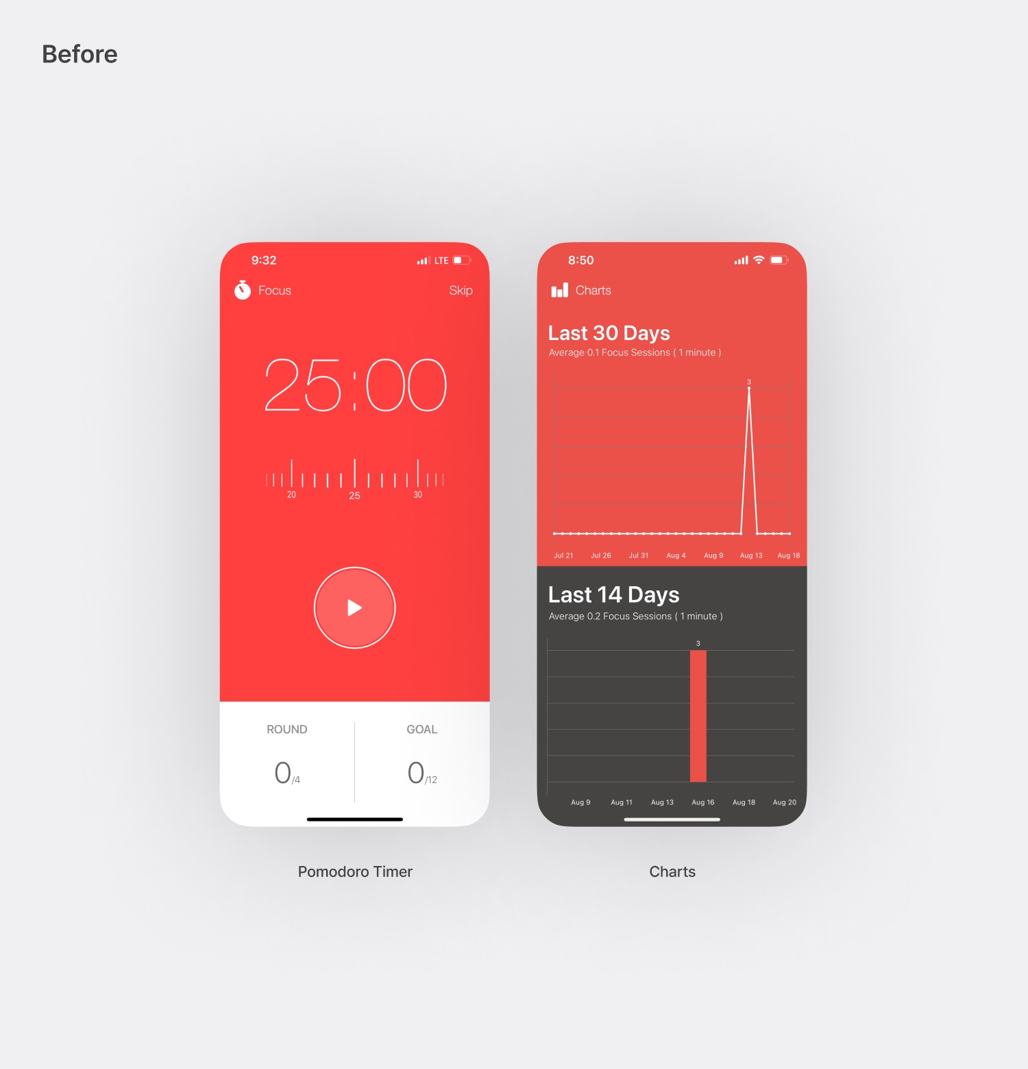
Users regularly flagged frustrations with the timer and chart interactions.
Expanding functionality would help Focus Keeper stay competitive and offer more value.
Switching to a subscription-based business model to incentivize future developments and reduce the entry costs to new features.
Habit-forming features could drive long-term engagement and recurring revenue.
01
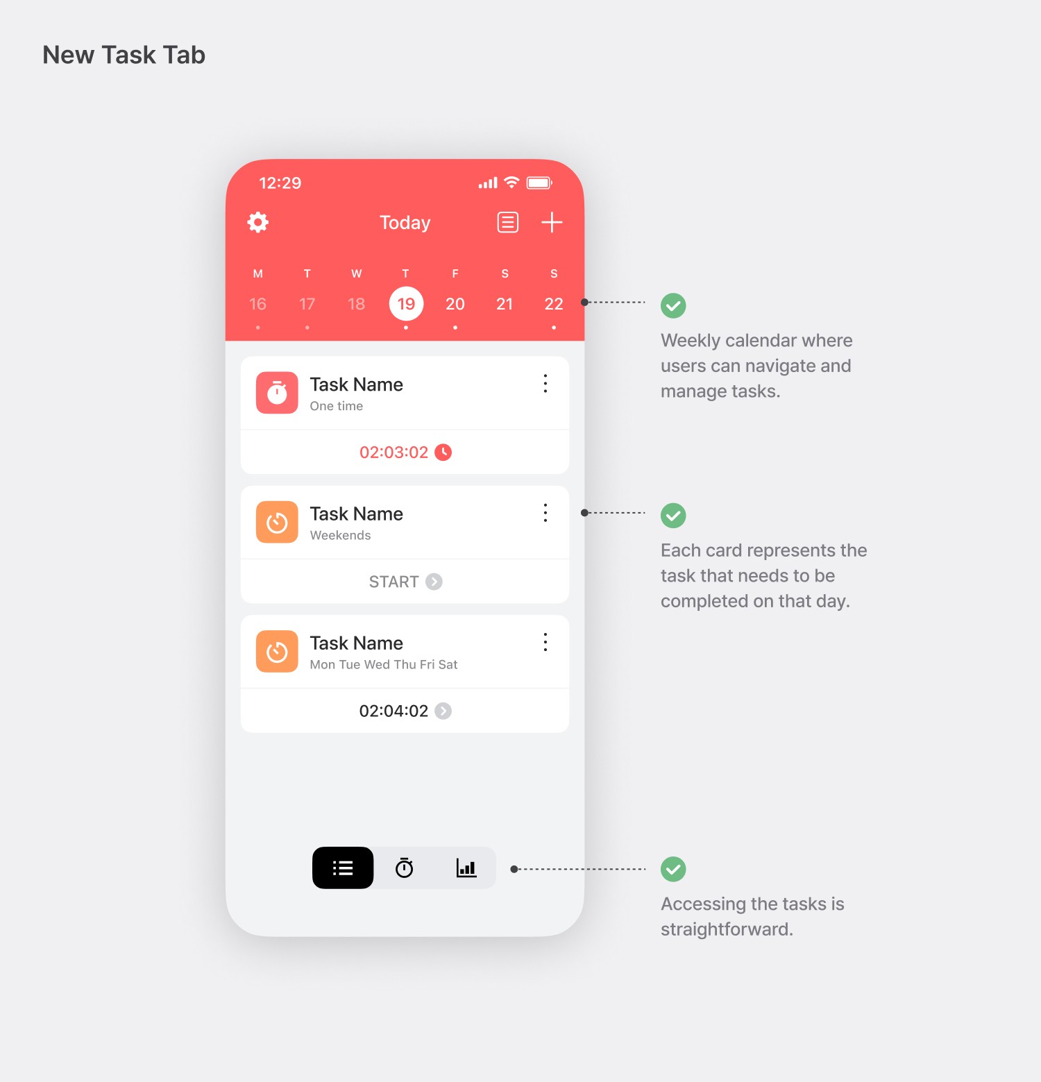
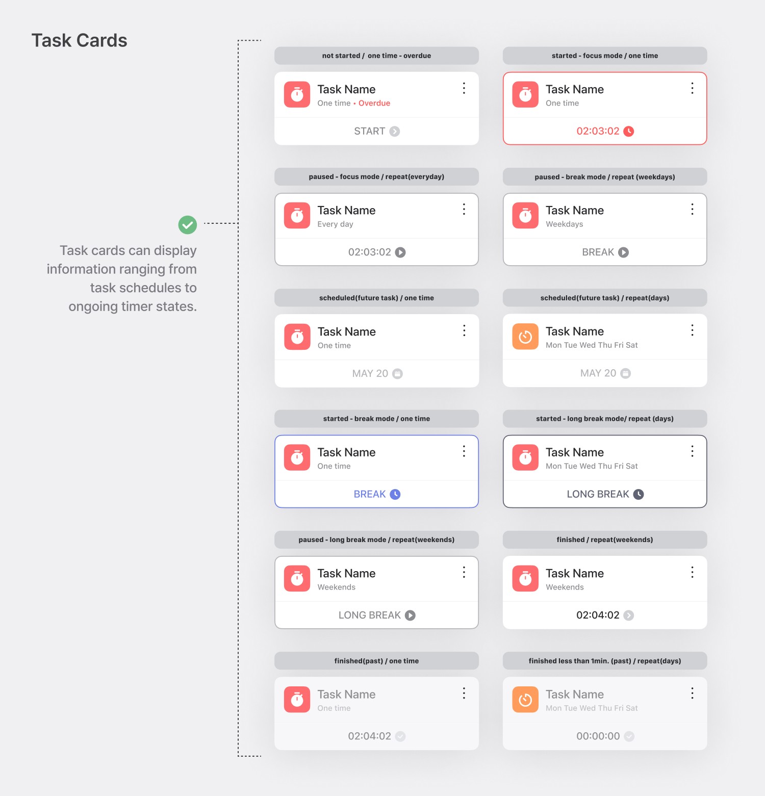
Integrating Task Management with the Pomodoro Timer
02
Maintaining the Iconic Timer Design
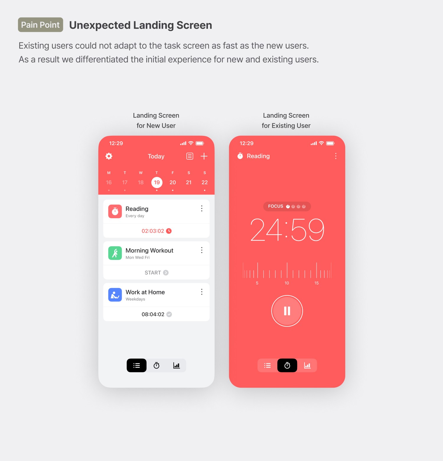
Focus Keeper is known for its simple, iconic red design, which significantly contributed to its viral success and easy recognition. Preserving this identity was essential in our update. After identifying major usability issues with the previous timer screen, I developed an intuitive navigation method between task and chart screens.


03
Problems Discovered through Validation
04
Delivering In-depth Analysis of Task and Time Data
Previously, users could only view session durations for the past 30 days and had to interact with individual data points to see daily session counts.
The new chart aimed to improve how users analyze task and timer data. With the shift to subscription-based memberships, we made high-level overviews available to all users, while detailed task-specific insights were reserved for pro subscribers.


01
Providing Delightful Experience
With the App Store saturated with similar Pomodoro and task apps, it became crucial to create a memorable and polished user experience that stood out from competitors.
With limited resources, we focused on features that are part of the main user flow, like the custom tab bar and task interactions.
02
Maintaining Consistency Across the App
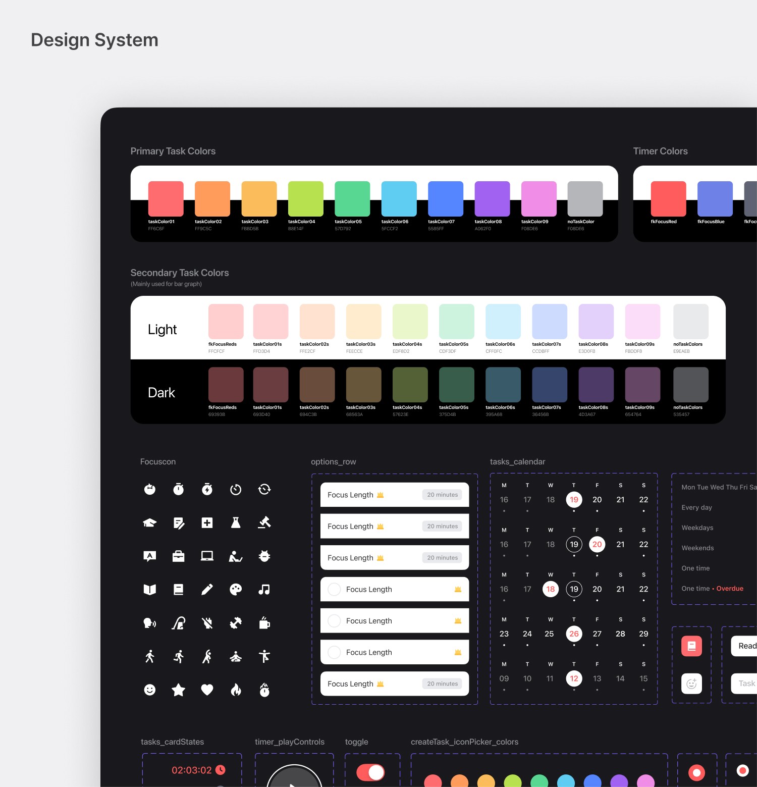
Due to legacy code constraints, much of Focus Keeper had to be rebuilt. I collaborated with developers to create a design system based on atomic design principles, ensuring visual consistency and reducing future development costs.

01
Initial Public Release (2021 2Q)

02
Chart Update Release (2021 4Q)

